http://www.thedarkspace.net/solaris_unfolds.htm
What I like: the details of the piece that give the mechanical look yet feels organic at the same time. the flexibility and grace in the movement of the animation
2. Joachim Sauter, Kinetic Sculpture for BMW Museum, 2008
http://www.joachimsauter.com/en/projects/kinetic.5.html
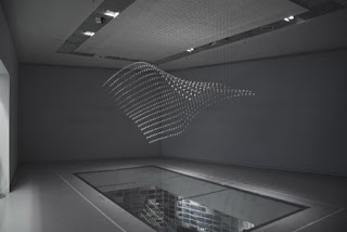 What I like: Again, I love the way it can morph into different forms, and the very simple but sleek look. It almost looks like an element in action.
3. Maxim Zhestkov, MODUL, 2009
http://zhestkov.com/
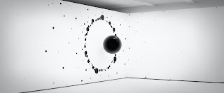 What I like: Using animation to create a kinetic digital sculpture, down to the basic color of black and white, like molecules interacting with time and space in a room.
4. Michael Rees, Putto, 2006

what I don't like: it looks awkward without the head and kind of nightmarish
5.Lee Aries, Beginning, 2003
http://www.fa.hku.hk/hkaa/artists.php?artist_id=102
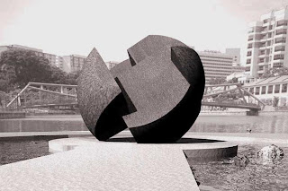 What I like: The organic and very simple shape, yet it tells a story.
6. Lee Aries, To Hong Kong, 2003
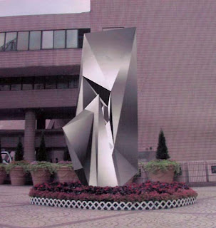 What I like: The simplicity & sleekness of the metal material and the design's shape.
7. Dan Collins, Twister, 2007
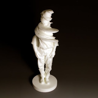 What I like: Looks like he's morphing into the air / disappearing
8. Bathsheba Grossman, Eltanin, 1993
http://www.bathsheba.com/gallery/eltanin/
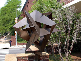 What I like: The piece reminds me of origami, due to the way the flat planes interlock with each other. I like that it is in a ball, which gives it an organic look despite its flat and sharp angles.
9. Bathsheba Grossman, Flow, 2006
http://www.bathsheba.com/gallery/beckman/
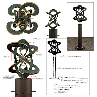
What I Like: I love how she has everything linked to each other so smoothly. She posted the process of how this was created, and I have even more admiration for it after seeing how it was put together.
10. Shawn Smith, Everett, 2008
http://www.shawnsmithart.com/images.htm
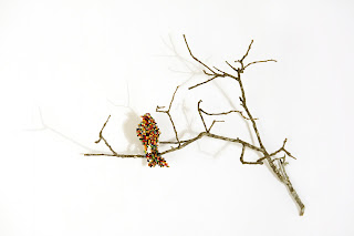
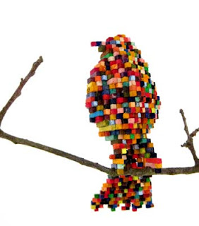 What I like: It looks like pixels but in the real world, and even though it's made of tiny cubes, you can really tell the form of the object in physical space instead of just flat like 2D pixels.
11. Shawn Smith, Parasited Shark, 2007
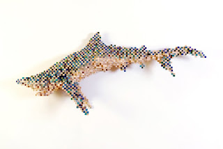
What I like: The colors used are not a flat color and it gels together when seen from afar.
12. Shawn Smith, 2010
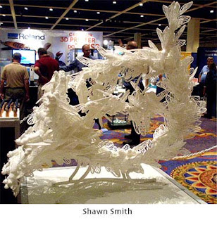 What I like: he used a mass of the same object to form another item (French horn)
13. Heather Gorham, 2010
http://www.sculptcadrapidartists.com/heathergorham.html
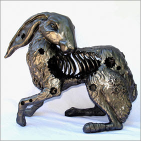
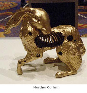 What I like: good use of digital technology to be able to show the inside of the rabbit. I love gears too.
14. Joanie Lemercier, Light Sculptures, 2007
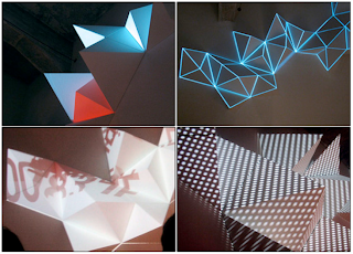 What I like: The effects look striking, the way the light is used, is indeed very witty, especially the balance between the graphics and color against the shadows and angles of the shapes themselves. The textures created by the lights (dots and different colors) give a very interesting effect.
15. Bruce Beasly, Query, 2003
http://www.brucebeasley.com/home.htm
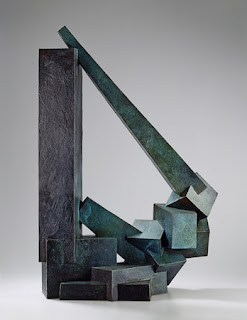 What I Like: the shapes used are very geometrical, but the placement reminds me of organic crystal formations, especially in addition to the color used in this particular piece.
16. Kenneth Snelson, Landscape 01, 2004
http://www.rocklandartcenter.org/digi2.html

What I like: The interlocking circles are like bubbles with secrets of the universe going on inside each sphere, and the lighting and color shown in this picture give a warm pleasant feeling.
17. Bruce Beasley, Untitled, 2005
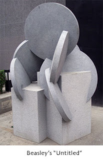 What I like: He challenges himself to keep to basic shapes to create visual compositions
18. Ken Snelson, Base Station, 2009
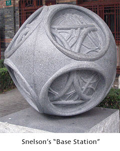 What I like: Mystery ball within a ball, looks like the inner piece could be moved.
19. Jon Isherwood, Burning through History, 2009
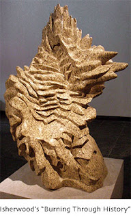 What I like: If I didn't know the title, I would think it was a kind of sand animal like a "sand shrew". I am not sure how the title related to it but nevertheless I still admire the form.
20. Robert Michael Smith, Paradise Bird Burlesque, 2009
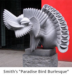 What I like: It looks like a single shape multiplied over giving the impression of motion, and at the same time forms the image of a peacock-like bird. Ingenious.
21. Robert Michael Smith, Timebender Bouquet, 2009
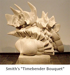 What I like: Again he used an object caught in its motion trail to create a dance-like metamorphasis.
22. David Morris, Matador's cape, 2009
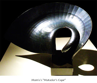 What I like: making the surfaces instead of completely smoothening out the curve gives the piece so much more texture and reminds the audience of its digital origin.
23. Ken Eward, Microsculpt, 2007
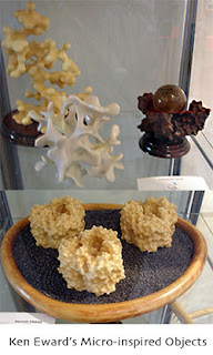 What I Like: That its inspiration is taken from natures micro-organisms, reminiscent of chinese rock arts. Appreciation for nature's beauty reproduced in a larger scale.
24. Keith Brown, Undulating Shapes, 2007
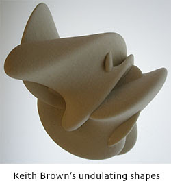 What I like: like a lava lamp, the shapes flow into each other, relaxing to look at.
25. Dave VanNess, Caribou Conflict, 2010
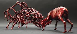 What I like: usage of a familiar occurrence translated into art. “Out of conflict beauty can be created. But in a grander sense only by the engagement of these two creatures can this beautiful crystal structure be created. This could be seen as the current, well seemingly eternal conflict of east and west.” the meaning behind the piece is deeper that I thought.

No comments:
Post a Comment